Wednesday, May 18, 2011

Questions to Answer

1) What talents do you think a digital artist requires?
A digital artist requires many characteristics to be happy and succesful in their career. they need to be willing to sacrifice their time, talent or a creative mind, discipline, effort and most importantly, patience.

2) Identify three possible Photoshop tools or items that were used in these videos.
  • the brish tool
  • mask tool
  • smudge tool
  • paint bucket tool
  • text tool

3) Visit http://foxsportsdesign.com/2009/07/mlb-all-star-game-magnet and identify TEN occupations that went into the making of this video. Research these occupations and give a brief explanation of what it is they do.

Production Company  is responsible for supervising the filming from the start to the end, and they hold the sole legal and financial responsibility of the movie as a whole.
A Producer is someone who creates the conditions for making the movie/video. they initiate, co-ordinate, supervise and control matters such as fund-raising or arranging for distributors.The producer is involved throughout all phases of the film-making process from development to completion of a project.
A Director basically directs the movie. He/she is in total control outside administration things like paychecks. He tells he actors/video makers what to do, ensures the sets are right, and etc. Directors have a say in the editing process.
DP (director of photography) has a role that is to give and provide a film with its unique visual identity
Art Director oversees the art, like the photographs and drawn images. They usually oversees the entire design department
Stunt Coordinator budgets, designs and choreographs the stunt to fit in with the description of the sccript.
Second Unit Directors  are rsponsible for shooting shots less imprtant like those of crowds, scenery, etc
Second Unit Producers creates conditions for less important scenes?
Second Unit Camera team that shoots subsidiary footage for a motion

Tuesday, May 10, 2011

Note for movie making 2

  1. the properties tool button is for changing the opacity
  2. start at 0:00 seconds
  3. to get movie title, move all your picture selections to the right and put title on layer above blank space
  4. under the edit menu is the title 
  5. warning: keep all stuff together and DONT MOVE THEM!!!! 

Friday, May 6, 2011

Comm Tech Notes for Premier

  1. click on new project
  2. tell premier to save in Thawspace and name folder (your name) video space
  3. click okay
  4. don't change settings
  5. click on get media and choose PC files and folders
  6. find your photos and add media
  7. your clips need to have names
  8. click on your photo and click on numbered stills at the bottom, select first pic and click open
  9. drag work on time-line below
  10. timeline and seen-line show the same info but use time lines its easier
  11. 3 tools at the top: selection tool, time stretch tool, split clip tool (looks like scissors)
  12. to get audio, go to www.sounddogs.com/
  13. right click on link
  14. save link as
  15. rename file so its clear
  16. click save in USB
  17. go to adobe bridge, open up animation photos
  18. open folder pic/ or select shift and select however many pics you want renamed
  19. click on tools menu
  20. at top it says batch rename> click it and rename> rename same folder
  21. for new file names, you can modify it
  22. change names and look at preview

Friday, April 1, 2011

Audacity?????? What?????

go to project, make a new lable track to insert music, Go to project > import audio
remember to bring head phones to class
the tool that looks like 2 arrows back to back, is the time shift tool and moves your music left - right
the eye bean (I) makes effect to one part of song, you select areas
the envelope tool works by clicking multiple times, it makes points and you can squish and expand points
draw tool (pencil) shapes the wave form
 the multi-tool mode is a combo of all tools, looks like *

What am i doing?????????

Wednesday, March 30, 2011

This is my IPOD SKIN : )
I did a party theme because its cool!

Wednesday, March 23, 2011

How To Make A Drop Shadow !

1. put all your layers into one folder and call it ipod 
2. make a duplicate of that folder, or make 2 copies of that folder
3. nam those two extra folders: shadow and the other: reflection 
4. merge shadow and reflection layers together
5. transform, flip vertically to get reflection
6. mask the reflection layer and go on gradient and use that to fade out ipod
7. to make a shadow, use other copy and CTRL>Click to fill it with black
8. scrunch down the black ipod and then blur it
9. reduce opacity of layer and move order of layers to get shadow in the back

Tuesday, March 8, 2011

Brusheezy.com

To download brushes

Layout Compositions

Seven Tools of Composition
  •  Hierarchy: relative importance of an element, going from most>least important
  • Focal point: the strongest most compelling element in a design (eye-catching)
  • Eye path: when your eyes follow a design or pattern
  • Porportion: size of an elemnt in porportion to another
  • Visual weight: lightness or darkness of a colour 
  • Type of visual element: 
  • Alignment (grid): order/rhythm. use it to place things on page. ex, margiuns on paper
They all have to do with the viewers attention
Design with INTENTION :)) <haha double chin

Thursday, February 17, 2011

Photoshop Note # 4

1. To navigate, use spacebar, navigation box,
2. The default colours in photoshop are black and white, black is foreground, white is background
3. Selections are important so you can select a specific object/item
4. To add to a selection, shift
5. Subtract seletion, use alt
6. Ctrl>Shift>I
7. Delete is Ctrl+D
8. Alt>Delete is to fill
9. Ctrl>click on thumbnail to get everything on layer selected
10. Name layers ALWAYZ!!!!
11. Duplicate your background layer as a backup

Wednesday, February 16, 2011

Photoshop Note # 3

If you want to move several layers at a time, use shift >select them to selevt multiple layers and move them around together

If you want to edit the background layer, double click it and then rename it

To get the selection back, use Ctrl>Click on the thumbnail on the layer to get selection, it will select everything on that layer

The shortcut to fill is Alt>Delete

Always name layers, click on name and then name the layer

If in doubt, turn layers off starting at top to see which one is messing you up

Tuesday, February 15, 2011

How To Make A Drop-Shadow

1. Use a text tool and write out your name
2. Right click on the layer to rasterize it
3. Drag that type down to the new layer icon to dupliate it
4. At the top left, use the move tool and lock the transparency, not the lock icon but the transparency
5. Go to Edit > Fill and fill it with black
6. Turn that lock off to blur it
7. Go to Filter>Blur>Gaussian Blur
8. Blur as much as you want and press pkay, then reduce the opacity in the layer chart
9. move shadow layer underneath the text and move it to the right/left and down

How To Make A ... Blapple?

1. use a qick selection tool to select the background
2. use the polygonal lasoo to select the stem
3. invert that selection so it is now on the apple
4. click on the layer adjustment which is hue/saturation

Monday, February 14, 2011

Photoshop Note # 2

Deleted is Ctrl+D
To invert something go to Select, then to Inverse, shortcut: Shift+Ctrl+I

Need a selection, then you can copy and paste, or drag using the move tool to put an image on a different layer. To turn layer on or off, click the eye. Click on lock transparency to fill the object only and not the whole layer. Use this to fill with black for shadow. To blur, go to filter, Blur, Gassian Blur, use gassian blur because you can adjust it to your liking. To get a selection back, hold down Ctrl key and click the thumbnail of the little picture. Shadow should always be under the object. Opacity is on the layer chart so you can see how much you see through and stuff.

Friday, February 11, 2011

Photoshop Note #1

To save your work, go to Select, then at the bottom go to Save Selection, and then you get to name your work, and then press save.
To change the colour, go to Image-Adjustment- Hue/Saturated
Zoom in to make selections
Shortcut for hand tool is spacebar
Spacebar +Ctrl will let you zoom in
Spacebar +Ctrl+ Alt will let you zoom out
Press Shift to add to a selection
Press Alt to take away from your selection

Monday, February 7, 2011

Principles Of Design *** Rhythm

Rhythm is a repeted motion, something that continues at an even pace or is evenly placed. Rhythm can also play tricks on your eyes.

This field above shows rhythm because the fences are evnly spaced apart to contain the green plants.

This picture above shows how rhythm can cause you to see the picture move when it isn't moving at all.

Principles Of Design *** Assymetrical Balance

Assymetrical balance is when a picture seems balance but when you divide the page/image in half, both sides are different but the denseness and the multiple objects can balance each other out.

The waterfall shows asymmetrical balance because both sides are balanced out by the other waterfalls.


This picture above shows assymetrical balance. Ichose this picture because at first glance it looks like it is symmetrical but a closer look tells you that there are significant differences in the image. For example, at the bottom, one side has an avatar while the other has some deadly creature.


Principles Of Design *** Symmetry

Symmetry is when a picture can be cut through the middle and both halves of the picture would be the same.


The Egyptian Sphinx was built so that it was symmetrical, see if you draw a line through the middle of it, both sides would be the same.
 
This immage is symmetrically divided at the points where the water meets land. Both sides, if it could be folded, would be exactly the same.


Harmony is when somethings go well with each other, for example, things that complement each other or are total opposites like the Yin and Yan.


This picture shows harmony because as you can see on first glance, they go well together and even though they are opposites (fire and water) they compliment each other.


Principles Of Design *** Porportion

Porportion in principles of design is shown when one object seems larger than another in comparison, but the objects are simmilar. Porportion is also when two objects have the same ration but can be made bigger or smaller but remain with the same ratio. 

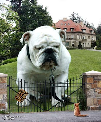
The big dog has been blown up in porportion meaning that it is probably 5 times bigger than an original dog. Looking at this dog compared to the fence and the small cat can definitly show how porportion is used.


This picture shows a gorilla inside a jar and that the gorilla can be compared to the size of the child. Clearly no gorilla can be that small. That is how this shows porportion.


Principles Of Design *** Emphasis

Emphasis is a principal of design that gives a particular are more dominace and stands out against the surrounding area.
In this picture, the rose is emphasised because the bright red rose is placed against a dull white background causing the viewers to look at the rose first.

In this image, the lips are emphasized, the seem larger, are more brightly coloured so eyes are draw to it first. Also the shape of the lip is wierd which add more emphasis to the lips

Elements Of Design *** Colour

Colour is an element of design that draws the viewers attention. Colour makes things look more appealing and therefore causes strong emotion feels. For example, red and black can make you feel really angry while sunshine yellow or sky blue can lift a persons mood.


In the picture above, there is a lot of colour and is moving, because of the colours applied to this wheel, it draws the viewers attention away from other things to just the wheel itself.
 
In the image above, your eyes are drawn to the paint first. This is a good example of colour because it shows how the bright colours work against a black background making the paint colours pop out!
As you can see, colour can also affect you phycologically . If you read the words above, many people will just be stating the colours automatically and nit the words themselves.


Elements Of Design *** Texture

Texture shows the feel of an object. For example: the roughness or smoothness of an object.

This ppicture shows texture because you can see the dents and roughness of the wall beside the stairs and the stairs themselves are smooth with sharp edges.


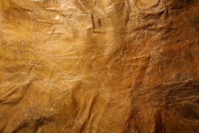
This picture shows how wrinkled some areas are compared to other areas. It shows how elevated some areas are and their smoothness compared to the lower areas which are rougher.
 

Elements Of Design *** Shape

Shape is something that is outlined to distinguish its form from the surrounding area. All shapes are made up of lines and take up space.

This shows shape overlapping other shapes to create more shapes. like triangles overlapping other triangles to make circles and swuares within.

Elements OF Design *** Line

Line is an element of design that form shapes and patterns. They come in many forms, for example: loose, straight, curly, jagged and etc. The repetition of lines can cause the forming of patterns and can have emotional impact on people like confusion, anger and happiness :)

This picture demonstrated the many types of lines there are, for exapmle, there are multiple wavy, jaged and curly lines. Looking at this picture sort of makes you feel confused as you try to understand the art. This would be the emotional impact the artwork would have on you.


Friday, February 4, 2011

Blogs

Blogs are so frustrating!!!
First you have to think of the title and stuff and then you have to to write stuff!
So because  i dont know what to write about, i'll talk about today (even if it is only the first period)
k so i woke up
and then i got ready and stuff and then i went out into the freezing cold outside world
I like the crush commercial on tv, cuz that guy is so wierd.
oh one time i went skiing and i fell down on the toe-rope because sometimes i lose my balance if i stand still for too long so then i got all tangled up in my ski's. and then people are just watching and telling me to roll off the toe-rope but they weren't the ones tangled up so eventually i rolled off and lost both of my ski poles. and then someone tried to be helpful and threw me my skie pole but it landed right out of my reach because gravity started pulling me down. and then we went home.